Create your first component
In this guide, we will create a simple component and add it to a service page.
Create the component
Create a new file in your catalog.
File
/components/service-note.astro
Add the component markup.
/components/service-note.astro
---
const { title = 'Service note' } = Astro.props;
---

<aside class="not-prose rounded-lg border border-gray-200 bg-gray-50 p-4 dark:border-gray-800 dark:bg-gray-900">
  <p class="m-0 text-sm font-semibold text-gray-900 dark:text-gray-100">{title}</p>
  <p class="mb-0 mt-2 text-sm text-gray-600 dark:text-gray-300">
    This note is rendered from a custom EventCatalog component.
  </p>
</aside>
The not-prose class keeps the documentation page typography from changing the spacing and styles inside your component.
Add it to a page
Open one of your service pages and import the component.
/services/OrderService/index.mdx
---
id: OrderService
name: Order Service
version: 0.0.1
summary: Handles customer orders.
---

import ServiceNote from '@catalog/components/service-note.astro';

# Order Service

<ServiceNote title="About this service" />
Check the page
Start your catalog and open the service page.
npm run dev
You should see the custom note rendered inside the service documentation.
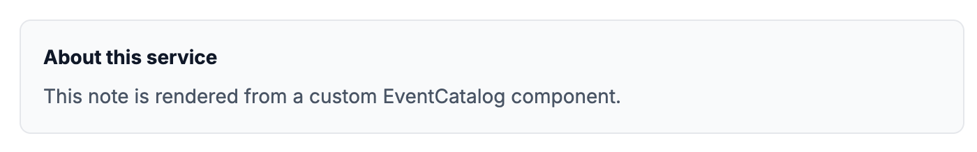 A custom component rendered inside an EventCatalog service page.
tip
Start small. Once you can render one component, the same pattern works for richer cards, tables, status panels, and diagrams.